

http://blog.cocoia.com/wp-content/uploads/2007/03//WimCrouwel.gif

http://grainedit.com/wp-content/uploads/2010/03/wim-crouwel-archive-2.jpg
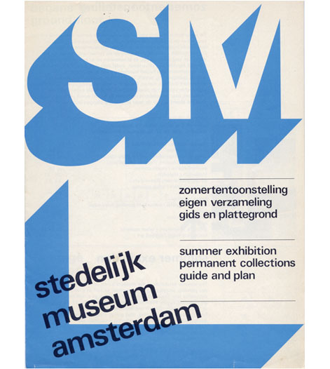
In this poster above I love how Crouwel makes the type look 3D on a 2D flat print for a poster. I also like how he has split the page into 2 columns and used the right hand column to display the information of the exhibition on at the museum. I also like how all the text is regimented and right alined and as the eye follows the poster down from the top of the page and the bold SM in 3D type to the information under neither and the across to which museum it is.

In this poster above again I am very much inspired by the 3D element crouwel uses in a flat 2D print. I also like the warn effect on the 3D part of the poster and also the color scheme that works well with it.

Here Crouwel has divided up this A2 poster into 2 columns which contains 3 rows in each half of the poster this is a good poster to be able to see how Crouwel works to a grid.


I found this poster design by Crouwel (top image) called Recent British Painting. And remembered I saw a design very similar by GF Smith Paper when I was researching the company and their work. Possibly the Designer has be heavily influenced by Wim Crouwel's designs.

In this poster again you can see How Crouwel has used a 3D element to his text which makes the text really bold and striking.

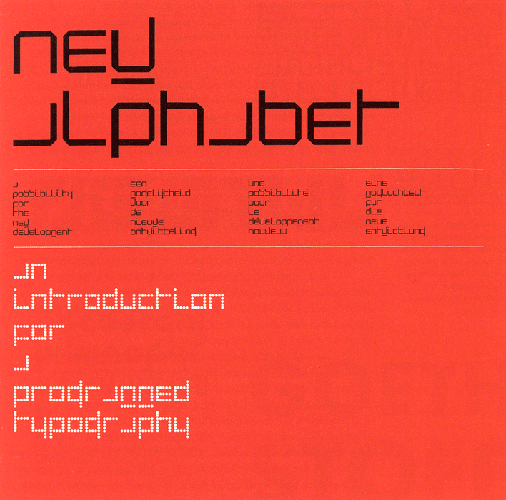
Here you can evidently see how Crouwel is working to a grid. I love how he has made his type look like its pixelated and retro computerized text.

No comments:
Post a Comment