I first added just a simple font over the top of the photo us Gill Sans typeface for all of the text. As you can see I put a 100mm border around the whole of the art board. With the type I adjusted the leading crunching the text closer together.
Here I have kept the leading and the art board boarders the same but changed the font from Gill sans to Bebas. I feel that the 100% black is to strong on the poster and over dominated the photo of the honey comb and the 100 hexagons. I left alined the main bulk of the text thats says "100 Years of GF Smith Paper" as that is where the eye is first drawn to. I then placed the text that says "Design Museum 1-31 July 2011" in the bottom right corner and right alined it because as you read the "100 Years of GF Smith Paper" your eye finishes to the right so so would naturally work diagonally down the page.
As I felt the 100% black was to strong and over shadowed the photo of the honey comb 100 hexagon structure I changed the opacity of the text from 100% to 75% and feel the text looks a lot softer against the image. I do feel that the Bebas typeface over dominates the whole of the poster and covers to much of the photograph in the background.
I looked back at my poster research into Wim Crouwel designs and was really inspired by the 3D effect he uses on his text in this poster above and started to wonder and explore how this could be possible to produce into my poster design.
I found on Adobe illustrator that if i typed my text in a simple type such a Gill sans, and then used the select tool and go to Effect on the tool bar at the top of the program and go down to 3D and the extrude I can make the text 3D.
In the screen shot above you can see the menu box that open when you open the 3D effect. this allows you to adjust the extrude depth and also the prospective of the type.
I feel that leaving the 3D effect as it was looks very cheesy and unprofessional so i started to explore new ways i could use this technique but make it look more professional.
As I started exploring a new way of using 3D text but not keeping the effect i have previously used, I did this by locking the layer the 3D effect type was on, and selected the pen tool and started to draw around the 3D extrude just to keep the shadow and outline of the type once I had done this I deleted the 3D effected type.
Once I had drawn around all the text "100 Years of GF Smith Paper" I selected all the out lines and changed the stroke from 1 pt to 5 pt. And as you can see from the screen shot above if you reflect back to my GF Smith Paper Company research, the text in the poster I created looked fairly similar to the GF Smith Paper logo (shown above).
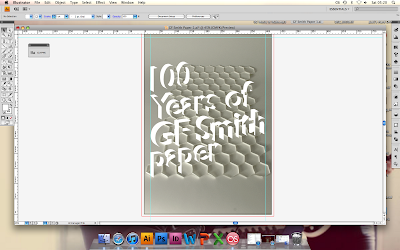
I thought That just using the outline of the text was difficult to read against such a textured background so tried by filling the 3D shadows with color. I first tried to use white (pictured above) but i felt that this is again difficult to read as the background image isn't quite dark enough to support this color.
I then tried to go back to 100% black as the new text isn't as bold and large as the Bebas type face. But i still feel that the 100% black is to full on and still over shadows the background image of the honey comb.
I then tried to to adjust the opacity of the new text to 50% but felt that it looked to washed out and that the background image swallows up the text to much and make it really difficult to read.


No comments:
Post a Comment