Saturday 26 March 2011

Final Poster


This is the final out come for my poster design for GF Smith Paper Celebrating their 100 years of trading. I kept my text at 75% opacity for all the text through out. I feel the because of the angle of 3D text it make the eye run down the text pointing the eye towards the bottom right corner where I feel the "Design Museum 1-31 July 2011 sits well in the space between the honey come and the edge of the page. i kept the same size borders all the ways around the posters.


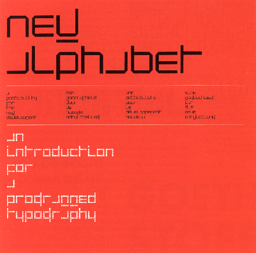
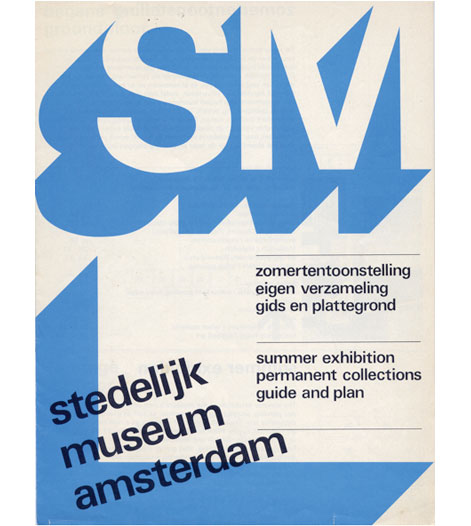
All the ways through the project I have used my research to gain ideas and take influence from. From the natural honey comb replicated in this design to the 3D type used my Wim Crouwel in his SM Designs. I am really pleased with the final outcome of my final poster I feel that the 100 hexagons in the honey comb structure reflects the 100 years of GF Smith Paper with out being to literal. I am really pleased with the photography and lighting skills I have also learnt through out this module. And felt I learnt a lot of new skills into how it is possible to craft paper learning from Richard Sweeney's Workshops.


If I was do change anything in this final design it would be part of the text I am really pleased with the 3D out come I have achieved by feel that because I only drew around the 3D extrude and shadow that on some of the letters to much of the shape of the letter is missing and is hard to make out at time. I would change this by as well as drawing around the 3D extrude and shadow I would also draw around part of the outlines of the letters but not make the stroke to thick so it doesn't wreck the 3D illusion of the text.

Designing my Final Poster

For the image of my honey comb sculpture I decided on using a photo of the full sculpture so you are able to see all 100 of the hexagons 1 for every year that GF Smith Paper Company has been trading.


 I first added just a simple font over the top of the photo us Gill Sans typeface for all of the text. As you can see I put a 100mm border around the whole of the art board. With the type I adjusted the leading crunching the text closer together. 


Here I have kept the leading and the art board boarders the same but changed the font from Gill sans to Bebas. I feel that the 100% black is to strong on the poster and over dominated the photo of the honey comb and the 100 hexagons. I left alined the main bulk of the text thats says "100 Years of GF Smith Paper" as that is where the eye is first drawn to. I then placed the text that says "Design Museum 1-31 July 2011" in the bottom right corner and right alined it because as you read the "100 Years of GF Smith Paper" your eye finishes to the right so so would naturally work diagonally down the page. 


As I felt the 100% black was to strong and over shadowed the photo of the honey comb 100 hexagon structure I changed the opacity of the text from 100% to 75% and feel the text looks a lot softer against the image. I do feel that the Bebas typeface over dominates the whole of the poster and covers to much of the photograph in the background. 


I looked back at my poster research into Wim Crouwel designs  and was really inspired by the 3D effect he uses on his text in this poster above and started to wonder and explore how this could be possible to produce into my poster design. 


I found on Adobe illustrator that if i typed my text in a simple type such a Gill sans, and then used the select tool and go to Effect on the tool bar at the top of the program and go down to 3D and the extrude I can make the text 3D.


In the screen shot above you can see the menu box that open when you open the 3D effect. this allows you to adjust the extrude depth and also the prospective of the type. 


I feel that leaving the 3D effect as it was looks very cheesy and unprofessional so i started to explore new ways i could use this technique but make it look more professional.


As I started exploring a new way of using 3D text but not keeping the effect i have previously used, I did this by  locking the layer the 3D effect type was on, and selected the pen tool and started to draw around the 3D extrude just to keep the shadow and outline of the type once I had done this I deleted the 3D effected type. 


Once I had drawn around all the text "100 Years of  GF Smith Paper" I selected all the out lines and changed the stroke from 1 pt to 5 pt. And as you can see from the screen shot above if you reflect back to my GF Smith Paper Company research, the text in the poster I created looked fairly similar to the GF Smith Paper logo (shown above).


I thought That just using the outline of the text was difficult to read against such a textured background so tried by filling the 3D shadows with color. I first tried to use white (pictured above) but i felt that this is again difficult to read as the background image isn't quite dark enough to support this color. 


I then tried to go back to 100% black as the new text isn't as bold and large as the Bebas type face. But i still feel that the 100% black is to full on and still over shadows the background image of the honey comb. 


I then tried to to adjust the opacity of the new text to 50% but felt that it looked to washed out and that the background image swallows up the text to much and make it really difficult to read. 


I then thought I would try to find a medium between the 100% opacity and the the 50% opacity so thought I would try half way between and go for 75% opacity. I feel that this sits perfectly balanced with the background photo of the honey comb. neither the background image or the text are to bold or strong, they sit perfectly together. you are still able to see almost all of the 100 hexagons in the honey comb representing the 100 years of GF Smith Paper Company. The new text now at 75% opacity has a nice soft gray which looks like it could be the same tint  as the shadows in the photo of the honey comb. 

Friday 25 March 2011

Task 2 Sculpture Final Photographs.

Just like in Task 1 I took my final sculpture to the work shop in up to use the professional equipment available to me. I again used the Nikon D60 camera, Infinity wall background and The professional lighting lamps where i was able to adjust the amount of light by switching off individual bulbs. 


The first 3 photo above are from a zoomed in prospective following the lines and columns of the honey comb structure. I really like these especially when i use the curve of the infinity background to produce a nature curve in my honey come sculpture as it rises up the curve the hexagons are more clear to see I also this this looks very similar to the honey comb image from my secondary research. I do not think these photo would work well in my final poster for GF Smith paper as the 100 parts of the honey comb are not clear so my idea wouldn't be effective in my final design. 


The 3 images above are of the honey comb structure as a whole. Im keen on these as it clear displays my idea behind having 100 hexagons in the honey comb one for each year GF Smith paper have been manufacturing. I feel these would work well as a final composition for my poster. I am particularly keen on the 2nd and 3rd images as they as better photographed i feel as they are more centered in the photo where as in the first image the honey comb runs off the picture. 


In These two image I was just playing around with the composition of the sphere from task 1 sitting on top of the honey comb from task 2 as I thought I could make an interesting final composition. 

Creating my second paper Sculpture for Task 2

Taking influence from this image in my secondary research and continuing the theme of using hexagons. My idea for the second sculpture to indicate 100 years of GF Smith Paper was to make a Honey comb structure made up of 100 elements one for every year the company has been in business. I thought this was a good way of indicating the event with out taking the brief to literal. 


I again for drew a hexagon on Adobe Illustrator using the polygon draw tool. But made the size much smaller as my structure was going to have 100 parts to it. 


In this image you can see the first of the 100 hexagons made up to make up my Honey comb. Again like in Task 1 where i made the sphere I made flaps on every side of each hexagon to made it easier to join each flap is 5mm. 


Here you can see how the first row of 3 hexagons fits together I glued each side of the hexagon with PVA glue. 


In the two image about you can see how the honey comb structure is taking shape I started the process by making rows of 5 but realised after 14 rows it was now larger than A2 so I had to make 14 rows of 7 and the 2 end rows either side rows of 8.

Poster design research

wim crouwel


Is a Dutch born and World renowned Typographer and Graphic design. Crouwel designed his first poster in 1952 and found a passion for arranging visual information. His works are well known for being set out and some time even containing grids. Much of his typographic work is influenced by Bauhaus and International Swiss design. His typography is seen as constructive type that needs to be assembled together. In 1964 Crouswel became the designer for all Stedelijk Museum in Amsterdam this collection of work became known as the SM Design. Crouwel also designed typefaces of his own called New Alphabet in 1967 (shown below).  this became famous for being on the cover of Joy Division album Substance. Crouwel also designed another 2 fonts called  Fodor and Gridni.


http://blog.cocoia.com/wp-content/uploads/2007/03//WimCrouwel.gif


http://grainedit.com/wp-content/uploads/2010/03/wim-crouwel-archive-2.jpg


In this poster above I love how Crouwel makes the type look 3D on a 2D flat print for a poster. I also like how he has split the page into 2 columns and used the right hand column to display the information of the exhibition on at the museum. I also like how all the text is regimented and right alined and as the eye follows the poster down from the top of the page and the bold SM in 3D type to the information under neither  and the across to which museum it is. 


In this poster above again I am very much inspired by the 3D element crouwel uses in a flat 2D print. I also like the warn effect on the 3D part of the poster and also the color scheme that works well with it. 


Here Crouwel has divided  up this A2 poster into 2 columns which contains 3 rows in each half of the poster this is a good poster to be able to see how Crouwel works to a grid.


I found this poster design by Crouwel (top image) called Recent British Painting. And remembered I saw a design very similar by GF Smith Paper when I was researching the company and their work. Possibly the Designer has be heavily influenced by Wim Crouwel's designs. 


In this poster again you can see How Crouwel has used a 3D element to his text which makes the text really bold and striking. 


Here you can evidently see how Crouwel is working to a grid. I love how he has made his type look like its pixelated and retro computerized text. 


Task 2 create a 100 year celebration poster for GF Smith Paper.

For Task 2 I have been asked to design a A2 poster celebrating 100 years of GF Smith Paper Company. The poster must contain this information on it:


100 Years of GF Smith Paper
Design Museum
01-31 July 2011


Who is GF Smith Paper Company? and what do they do?


http://www.djgraphicdesign.co.uk/images/gfsmithlogo.png


GF Smith Paper are a specialist paper company based in Hull, founded by George Frederick Smith. Gf Smith manufacture a variety of unusual papers stocks for Printing and Graphic Design industries. These paper stocks are used for creating business stationary such as business cards, letterheads and folders. The paper stock has also been used for promotional material such a brochures, booklets and posters. They also create Cards and Packaging. 


GF Smith Advertise themselves by stating;
"wherever there is a need for paper there is a need for GF Smith."

information taken from; http://www.gfsmith.com/about


Here are a few images taken from The GF Smith Paper company website.


These first two images above are from the GF Smith mailing scheme where Graphic Designers or Print Companies can sign up to receive new and free samples of GF Smiths new and latest papers. I really like these advertisement designs by GF smith, I love the crisp typography and how the are not worries to run words off the page i also like the metallic printing process the first design has gone through. on the second design i think it is very clever how they have layed up the translucent paper so you can still just about see words through the top layer from the later underneath.


This poster is to advertise there 111 year  celebratory tour  around universities exhibiting their design collaborations. This Poster was designed by SEA an award winning british design company set in in 1997 by designers Bryan Edmondson and John Simpson.


This last image is taken from a GF Smith samples advertisement book , advertising al the different range and samples of papers they produce. 

Photo's of my Final Sculpture Task 1

These are just some of the photos I took of my final sculpture in the University workshop using professional techniques. The equipment used to create these images were;
  • A Nikon D60 Camera set on manual. 
  • A large infinity background (a large background with no corners just one large curve).
  • And 2 adjustable lamps. These had 5 separate light bulbs in them which were al controllable with switches so you could determine how bright/ dark the set will be, by switching off individual bulbs. 
in the photography work shops we were taught how the aperture (the lens that opens and closes to let more or less light in) work together with the shutter speed to control how much and fast the light hits the film inside the camera. 

I learnt that the larger the aperture the more light is let in and you need to have a smaller f-stop. The smaller the aperture he less light is aloud in so which means you have a higher f-stop. the f-stops range from. 

f2.8, f4, f5.6, f8, f11, f16, f22, f32. Each one of these allows in half or double the amount of light depending on ow large or small your aperture is. 

I also learnt that the shutter speed of the camera effects the quality of the image. the shutter speed is measured in factions of a second which also like the halves or doubles the amount of light let to the nex faction just like the aperture does. 

We also learnt how to a just the setting s to what you require. WE used the cameras on manual mode. This allows you to set the white balance, ISO rating, Focus mode and the metering mode. 

I found these new techniques difficult to pick up as I have only had a very limited amount of photography experience, but from what I have learn in the workshop was very useful to me and has helped me to gain an interest in wanting to learn more about photography as it would be a use skill to learn in this field of work. 

The images below are just a few of the end results from this photography session.